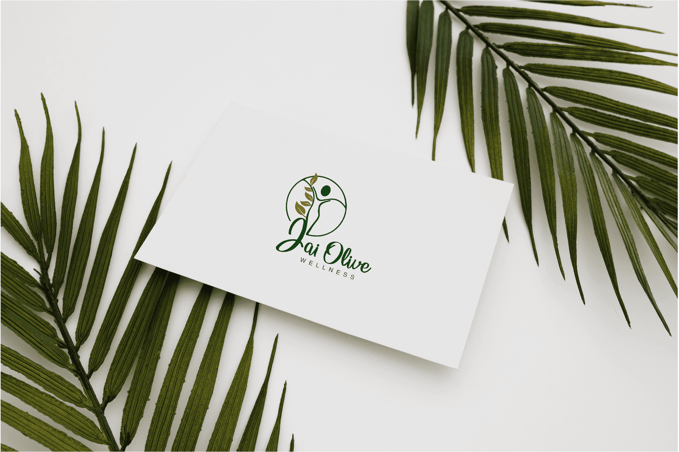
Jai Olive Wellness Logo
Jai Olive Wellness is a nonprofit organization that helps improve perinatal health through health and wellness education, doula services, and yoga, focusing on providing services for underrepresented families.
Organization
Jai Olive Wellness
Services
Logo Design
Role
Brand Designer
As the brand designer, I worked with the client to rebrand the logo, ensuring the visual identity clearly communicated with the purpose of the service. I focused on translating the client’s values—feminist, elegant, friendly, and organic. I explored typography, color palettes, and symbolic elements and developed a refreshed visual identity that not only aligns with the brand’s values but also creates a stronger connection with its audience.
Logo Evolution: Before & After Redesign
Logo sketches to brainstorm ideas focusing on elegant, welcoming, and organic
10 versions of the logo were created on Adobe Illustrator after refining the ideas and getting feedback from the client
Based on the sketches, I translated to Adobe Illustrator. Overall, I focused on round and organic shapes, a human figure, and vinyl to reflect the work of the organization.
Established branding guidelines consisted of logo usage, typography, color palette, and icon
I've created a branding kit, including colors, logo, secondary icon, Black and White version, and font choices.
The logo was established and used across on the client's print and digital platforms
The icon was used across LinkedIn, Instagram, and other social media platforms. This refreshed brand brings more credibility and


