Digital Control Display
A software application display for B2B clients to use as a design display for their own control display.
Client
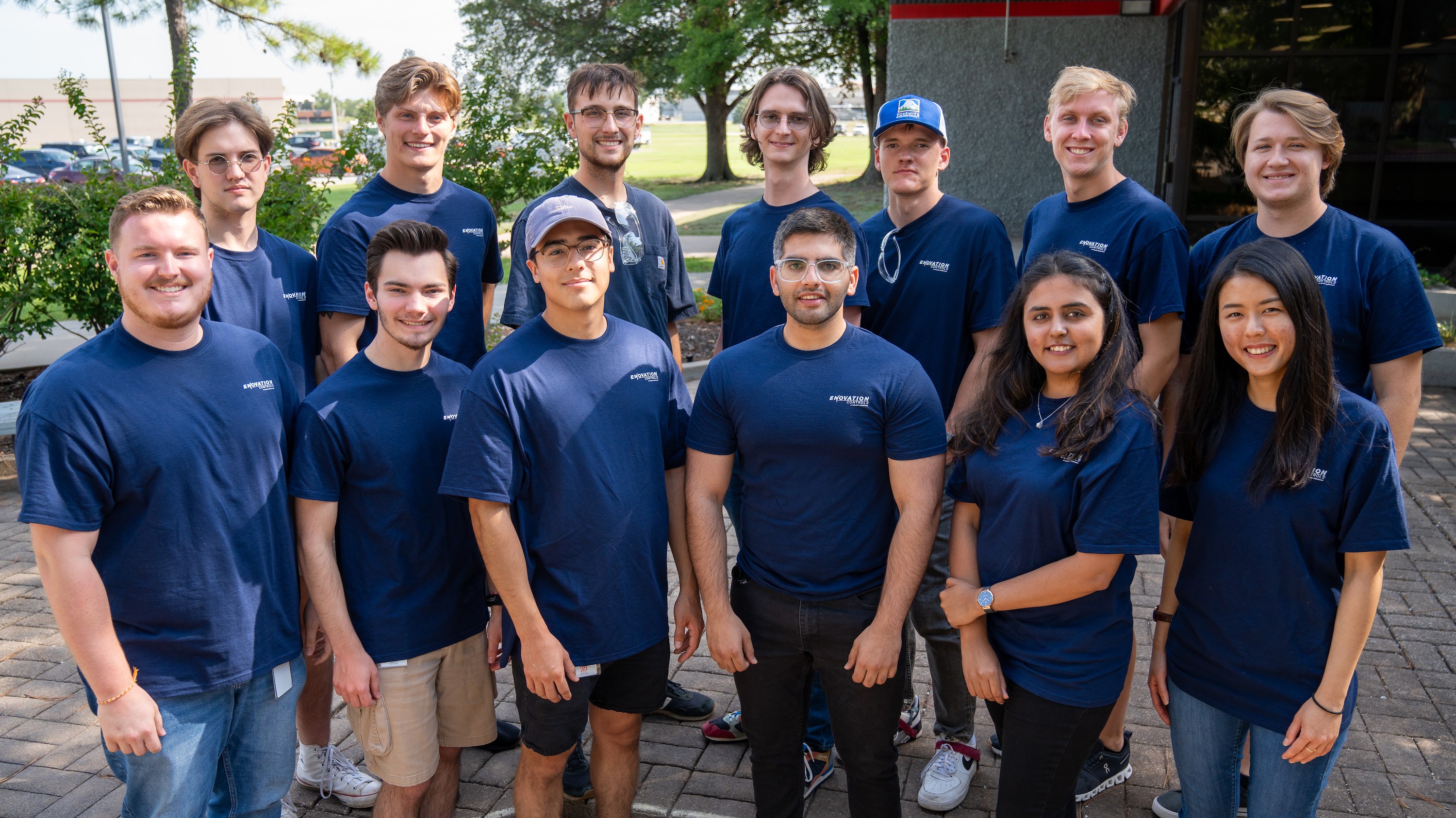
Enovation Controls
Services
UI Design
Industries
Manufacturing

PROJECT SCOPE
Design a user interface for hardware with a display size of 800x480 px, based on defined business goals and objectives. There were two UI designers (including myself) and three software developers. The image below is a concept design created by the developer team.
SKETCHES
The sketches focused on a simple, modern design. I explored various layouts with left-side navigation for consistency with other company displays, testing different placements and sizes for numbers and buttons.

CHALLENGE
The main challenge was the small hardware size (800x480 px), making it difficult to predict appropriate touch target sizes. While Nielsen Norman recommends 38x38 px and W3 suggests 44x44 px for touch interactions, these guidelines are tailored to mobile and web, not hardware screens.

DESIGN ITERATIONS ON FIGMA
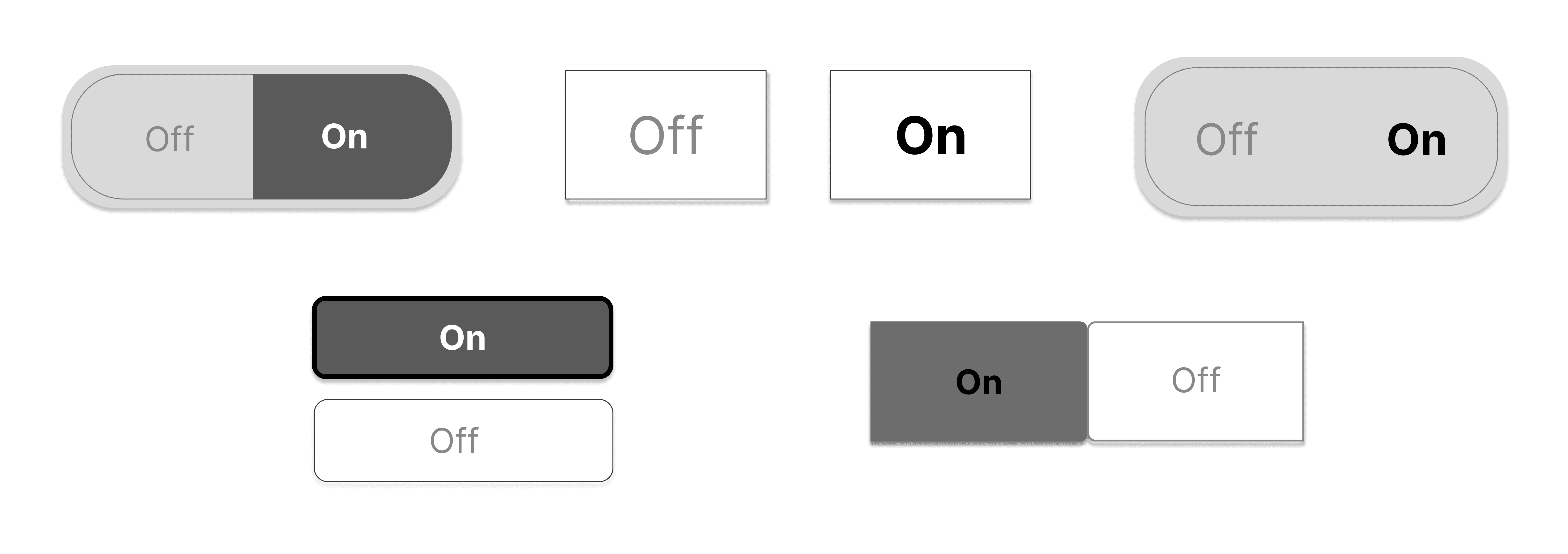
The design direction of the sketches focused on simplicity and modernism. A few different layouts were created prioritizing accessibility and straightforward information.
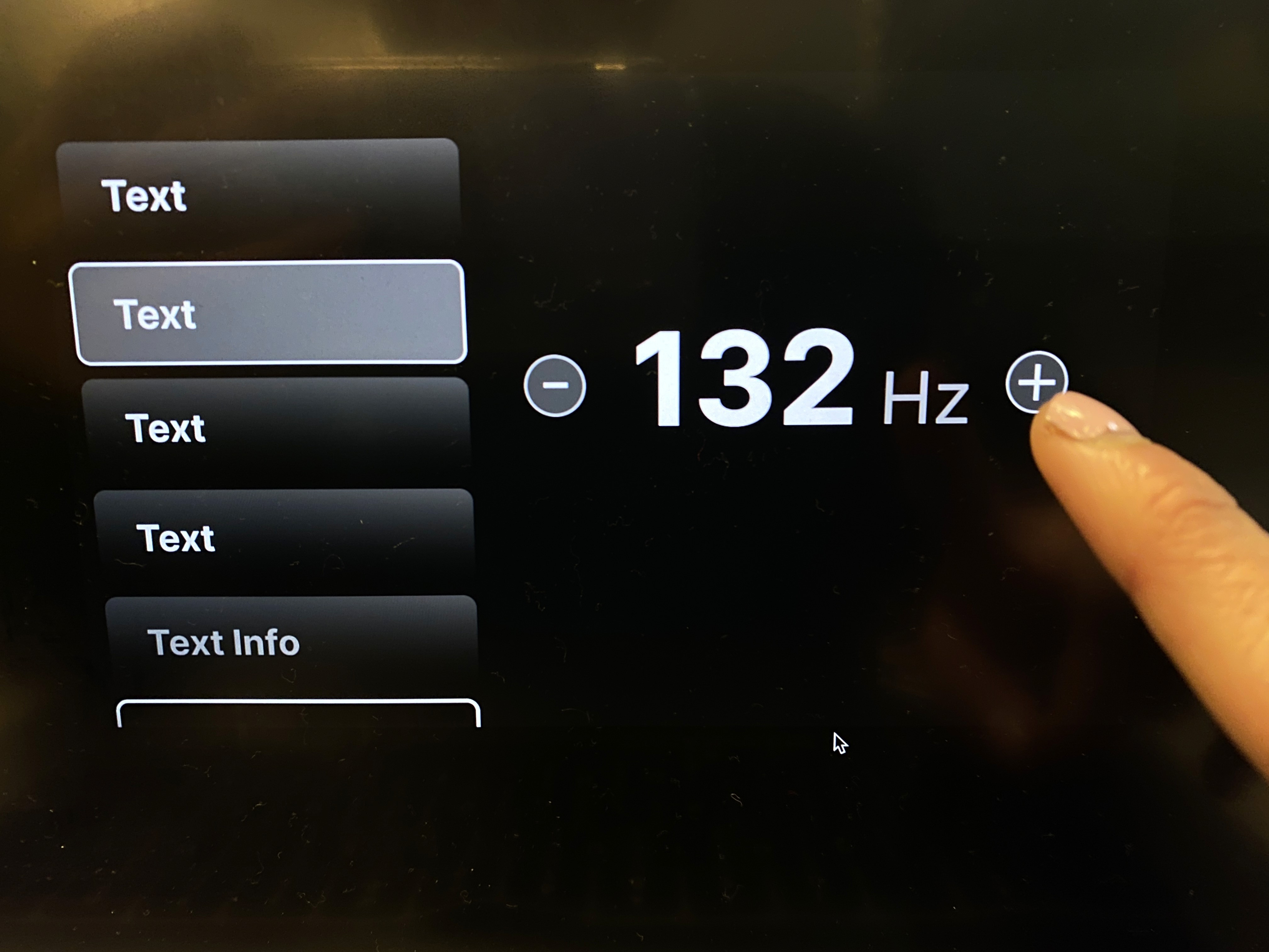
HARDWARE TESTING
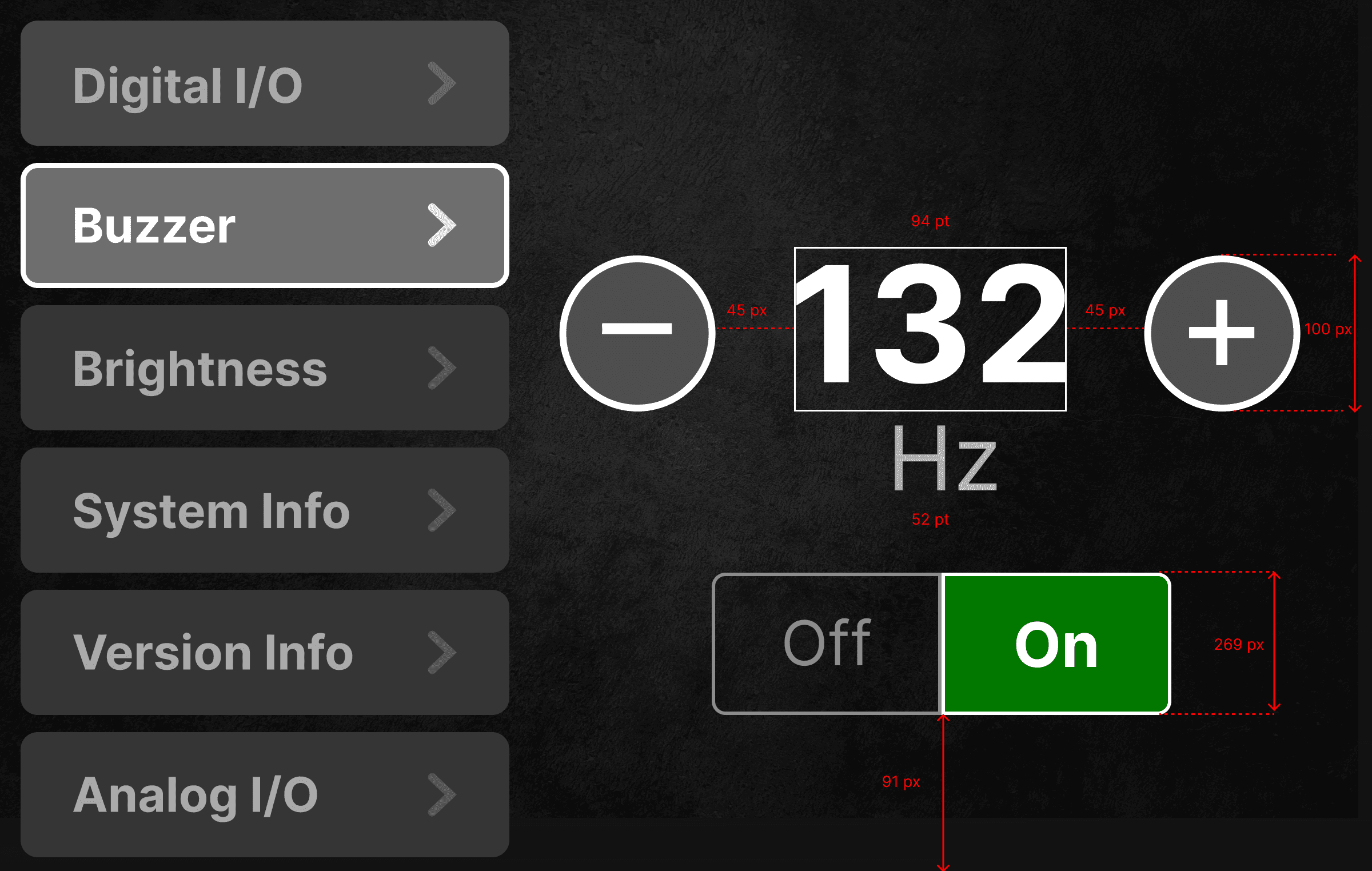
Since there were no button guidelines for the hardware display, I initially used the suggested 44px size and tested it in Figma. The buttons were too small, so after discussions with the engineer and further testing, I increased the size to 100x100px to ensure they were easily clickable and accessible on the touchscreen.

LIVE TESTING
After multiple tests on the hardware, we decided to move forward with the rectangle with rounded corners because it has a large touch target size, and the rounded corners create a user-friendly approach. The video below shows one of the user-testing sessions.
PROCESS: WORKING WITH CROSS-FUNCTIONAL TEAMS
After each screen was made, the screens were imported to Zeplin for the developer team to view the design components, properties, typeface, font size, and pixels. The components, font types, and graphics were saved separately in a collaboration file.

RESULT: DESIGNS WERE COMPLETED AND HANDED OFF TO THE DEVELOPER TEAM
Due to confidentiality, I'm unable to view the final designs. Please reach out to me if you would like to discuss further.
PRODUCT WAS SUCCESFULLY LAUNCHED IN JULY 2023
After two weeks span of time working on designs and collaborating with three software engineers, the product was launched in July '23. After it was launched, it was confirmed that 6 individuals were actively using the tool.
HIGHLIGHTS FROM MY INTERNSHIP EXPERIENCE