
JOURNAL ENTRY
I Thought I Knew Everything About Accessibility. I Was Wrong.
AUG 2026
By Angeline Neo
5 min read
I thought I already knew what accessible design meant, but this project showed me how much more there was to learn.
As a graphic designer at the University of Florida (UF), one of my projects was designing an award nomination website for UF employees. The old website had too much information, making it hard for users to understand the criteria and standards for nominating someone. UF is required to meet WCAG 2.1 AA / Section 508 standards, so alongside the design work, I also had to remediate the existing site to meet those requirements.
[image of previous website]
My initial idea was to make it more visually engaging by including animations and graphic elements. For example, I wanted to use a scrolling effect to break up the Awards Division instead of the long static list shown below:
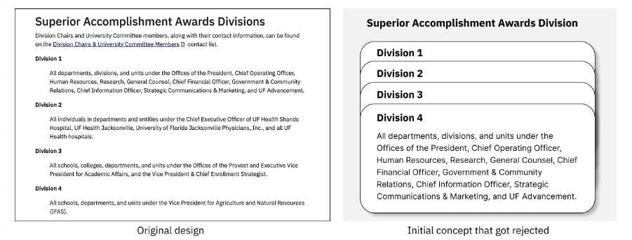
My prior knowledge of accessible design was mostly strongcolorcontrast, legible typography, and alt text on images. But talking it through with the web developer, I learned that scrolling effects like this canactually disorientscreen reader and keyboard users. That was the first moment I realized "engaging" and "accessible"aren'tthe same thing. A website can be simple, intuitive, and appealing, but complex animations and decorative fonts can just as easily break accessibility rules. After studying the guidelines more closely, I developed another version, this time putting accessibility at the forefront.
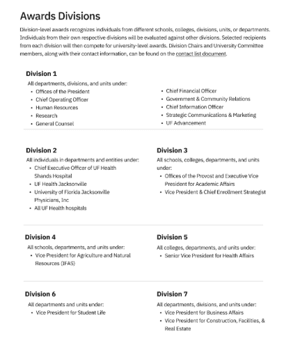
After a few rounds of iteration and feedback from stakeholders, we landed on this design, which was much easier to digest. The link leads to a Word doc with the full list of division-level information — this cuts down the text on the page while still giving users a clear way to access the full details if they want it.
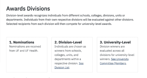
After redesigning the entire website, I worked with the developer to check and remediate it for full accessibility. We also ran a screen reader test using NVDA to make sure the content read through smoothly. One small but important change: the division-level link text. Instead of a generic "View here," I changed it to "See Division List."
I still have a lot to learn myself, especially how code shapes accessible experiences. But if this project taught me anything, it's to ask a different question before every design decision: not just "will this work," but "who might this not work for?" I hope other designers start asking themselves that too.