
Chronic-Wound Care Mobile App
The Chronic-Wound Care is a mobile app designed to support patients with severe wounds. It helps users track their healing progress and access educational resources. The app is used alongside a wound therapy machine (VAC). The project was advanced to the Minimum Viable Product (MVP).
Organization
3M
Services
UX Design
Role
UX Design Intern
DEMOGRAPHICS: OLDER ADULTS PATIENTS
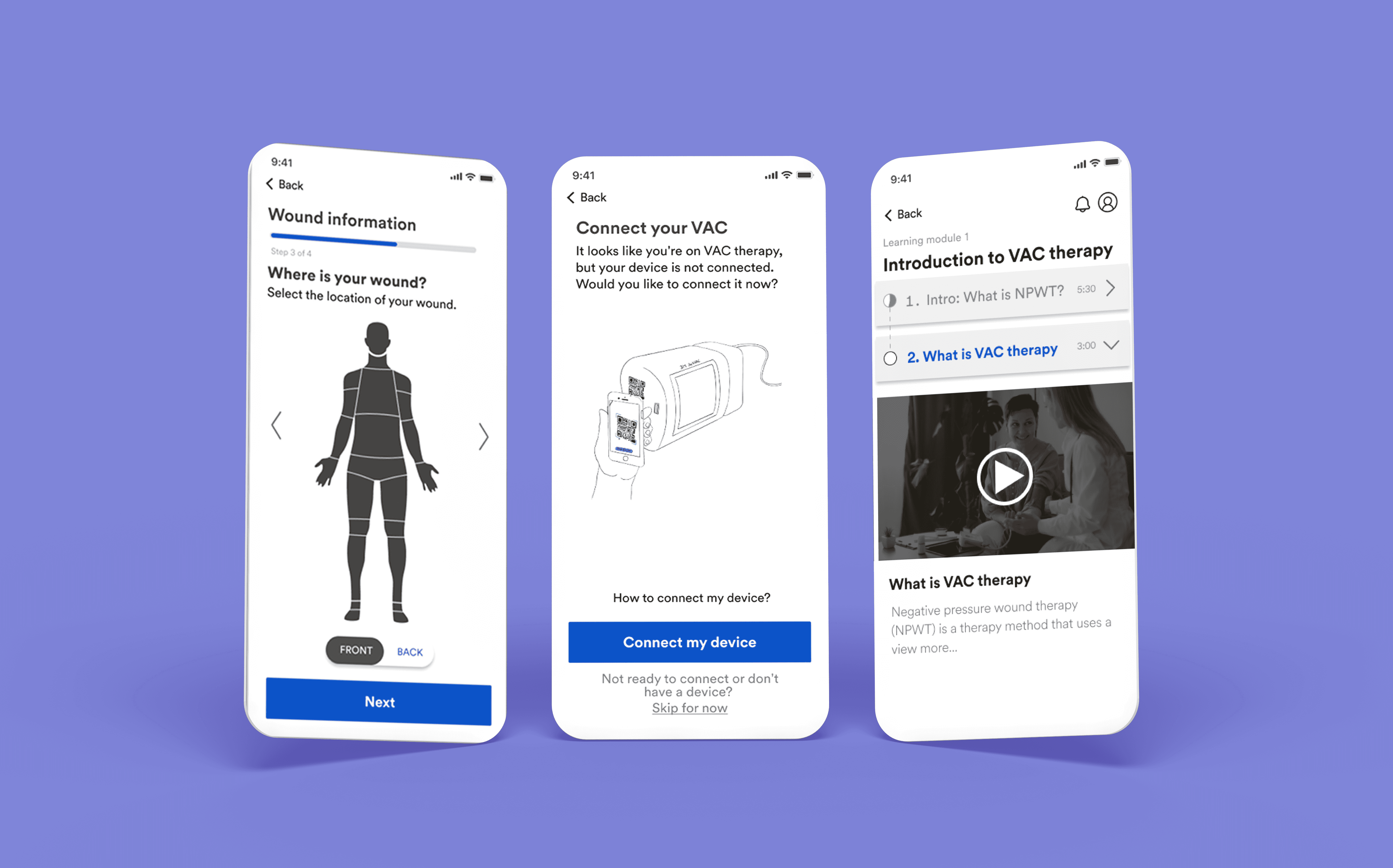
Diabetics, accidents, or infections usually cause patients with chronic wounds. The pain in chronic wounds arises from either tissue damage or irritation of nerve endings. This resulted in mobility issues and poor clinical outcomes. Patients use negative pressure wound therapy to help the wound heal more quickly. (Image shown below)

BACKGROUND: THE MOBILE APP
Chronic-Wound Care app, a.k.a MyWoundHealing app, is an existing mobile app that supports patients with chronic wounds (diabetics, accidents, etc.) to achieve a holistic positive health outcome. Since these wounds are severe, patients use negative pressure wound therapy to help the wound heal more quickly.

MY ROLE
End-to-end design process including information architecture, prototypes, concept generation, UI designs
Collaborated with UX researchers to find out about the key insights and findings from user interviews
Actively participated in meetings with external stakeholders, including the global marketing leader and project manager for design feedback and iterations
PROBLEM STATEMENT
A team of UX researchers conducted user research (I was not involved in this research) to discover patients' needs and pain points of using the MyWoundHealing app while undergoing wound therapy. One of the findings was that patients do not feel engaged with the current app's educational content due to poor usability issues. This resulted in only 2% of patients downloading the app. Hence, the question statement is:
RESEARCH PART 1: APP FLOW
To find out why the education content was not engaging, user flow and information architecture were created to find out UX issues.

RESEARCH PART 2: INFORMATION ARCHITECTURE

Educational contents were highlighted in purple to indicate the amount of videos
FINDINGS FROM RESEARCH 1&2
Observed cluttered content with a mix of video and text-based instructions.
Inconsistency in video length, ranging from 2 to 20 minutes.
User flow indicates that more than two steps are required to learn about a topic.

PROPOSED INFORMATION ARCHITECTURE
Redesigned the information architecture that removed repeated contents andmore organized information with less than 3-clicks

RESEARCH PART 3: MARKET RESEARCH
Analyzed a few similar apps for UI design inspiration
I looked into several apps, including Headspace, Wonar Health, Duolingo, Hinge Health, Coursera, and Khan Academy. This market research gave me valuable perspectives on user-friendly interfaces, engaging content from visually appealing UI designs, and the user experience of the overall navigation.

PROPOSED CONCEPTUAL LOW-FIDELITY DESIGNS
Personalized educational content, large-sized touch targets, and less cluttered information to reduced cognitive load
I translated key UX and UI features identified in market research, and studied the accessiblity guidlines for older adults into a low-fidelity wireframe for a basic representation of the app's layout and functionality. This iterative design process, lasting two weeks, involved ongoing discussions with the UX team and external stakeholders to receive feedback and continue refinements, aligning business goals with patients' needs.

DISCLAIMER
I presented the conceptual designs to a team of internal and external stakeholders. This project proceeded to the advancement of MVP. Due to the confidentiality of this project, I am unable to show the full process. Please reach out to learn more about it.
3M INTERN COHORT
