Chronic-Wound Care Mobile App
Chronic-Wound Care
Mobile App
The Chronic-Wound Care app, also known as the MyWoundHealing app, is a mobile app designed to support patients with serious wounds—such as those caused by diabetes. It helps users track their healing progress and access educational resources. The app is used alongside a wound therapy machine (VAC), which patients are connected to promote healing.
Organization
3M
Services
UX Design
Role
UX Designer

OVERALL PROCESS
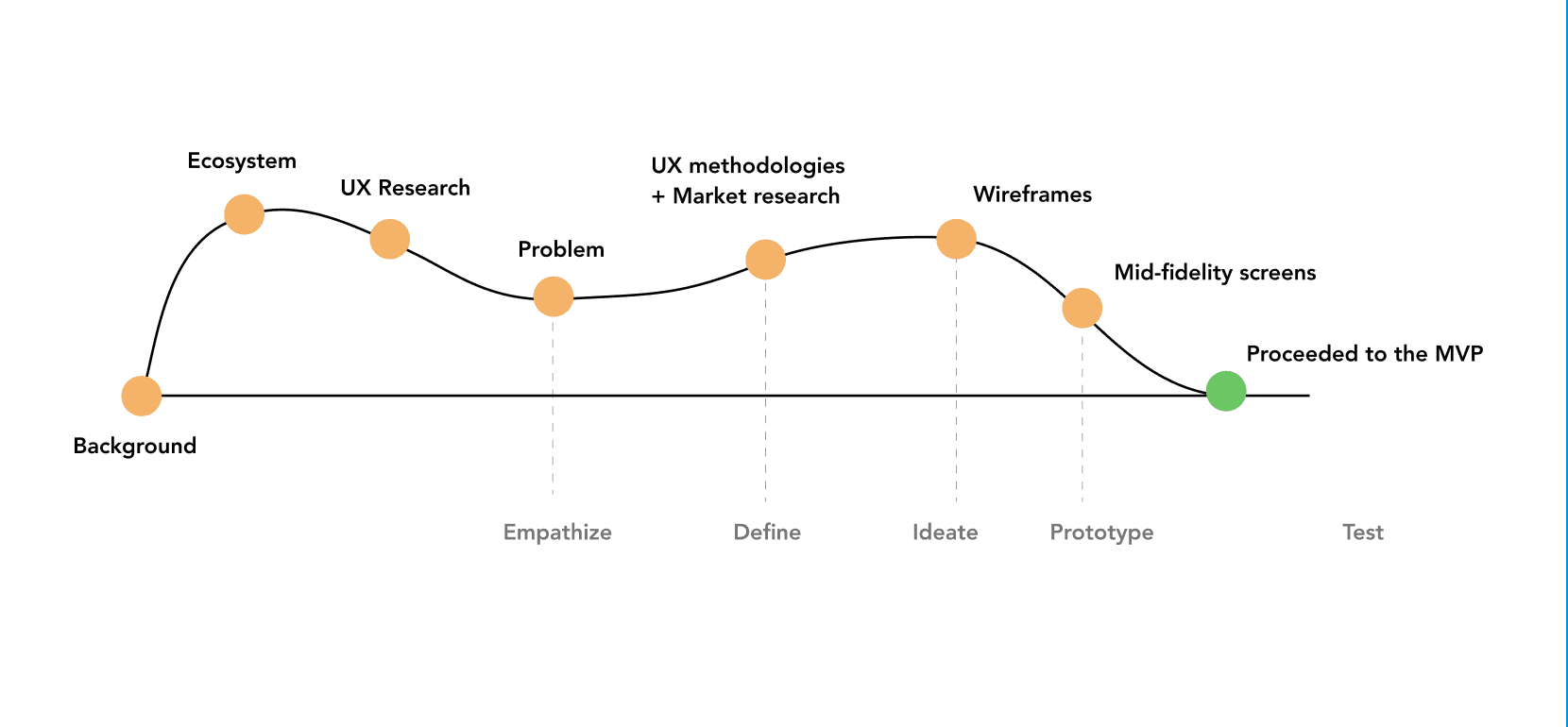
LEARNING ABOUT THE HEALTHCARE ECOSYSTEM
The Healthcare Business Group team filled with smart, talented people.
UX RESEARCH + PROBLEM STATEMENT
A team of UX researchers conducted user research (I was not involved in this research) to discover patients' needs and pain points of using the MyWoundHealing app while undergoing wound therapy. One of the findings was that patients do not feel engaged with the current app's educational content due to poor usability issues. This resulted in only 2% of patients downloading the app. Hence, the question statement is:
UX METHODOLOGY 1A: BREAKING DOWN EXISTING SCREENS
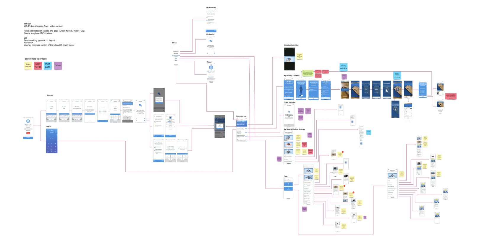
To find out why the education content was not engaging, user flow and information architecture were created from the current MyWoundHealing
mobile app.
MY FOCUSED: EDUCATIONAL CONTENT
To find out why the education content was not engaging, user flow and information architecture were created from the current MyWoundHealing mobile app.

To find out why the education content was not engaging, user flow and information architecture were created from the current MyWoundHealing mobile app.
UX METHODOLOGY 2: Heuristic analysis was used method to identify design problems in the app

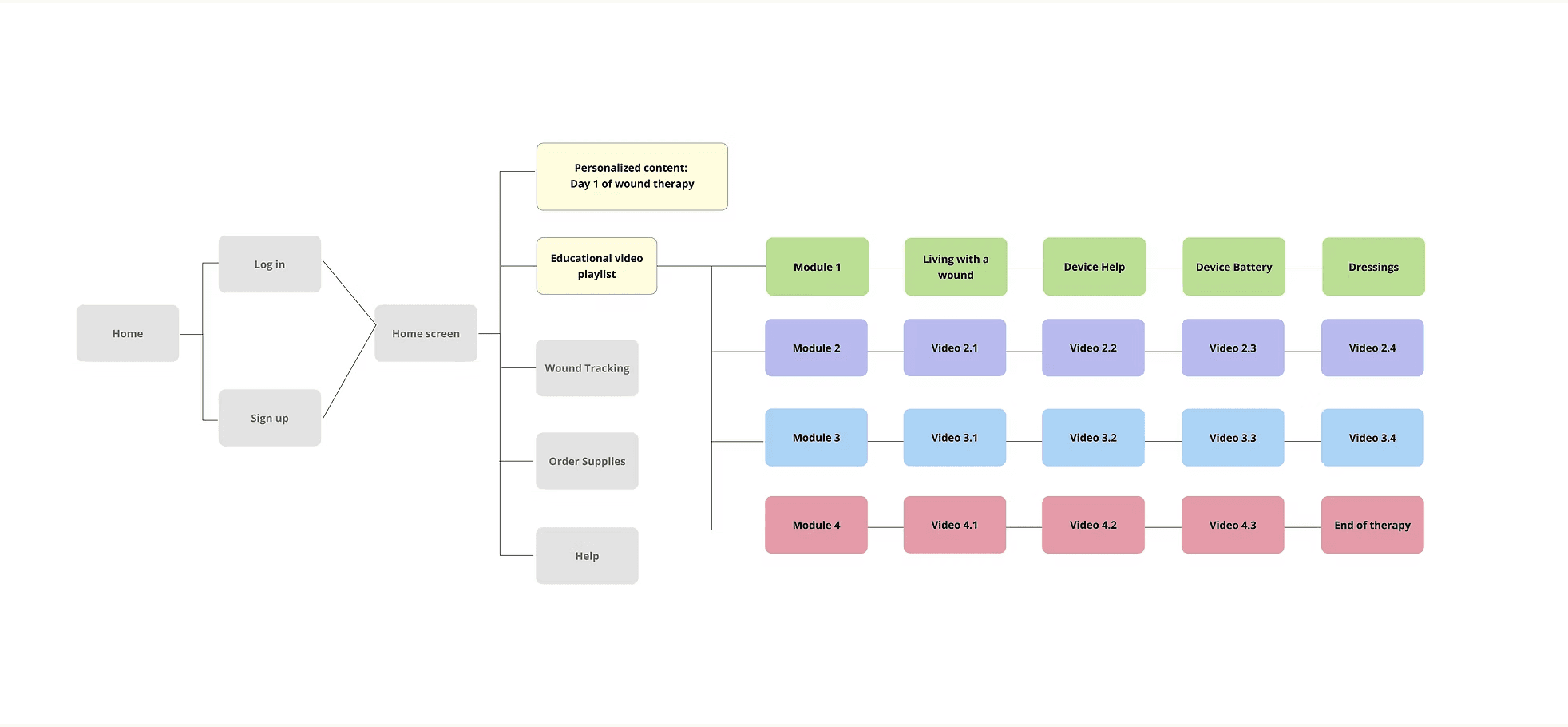
Based on the issues and user flows from the existing mobile app, an information architecture was created to reduce cognitive load, improve navigation, and ensure that users don’t feel lost or overwhelmed by the educational content.
UX METHODOLOGY 3: Information architecture was created to improve the user flow
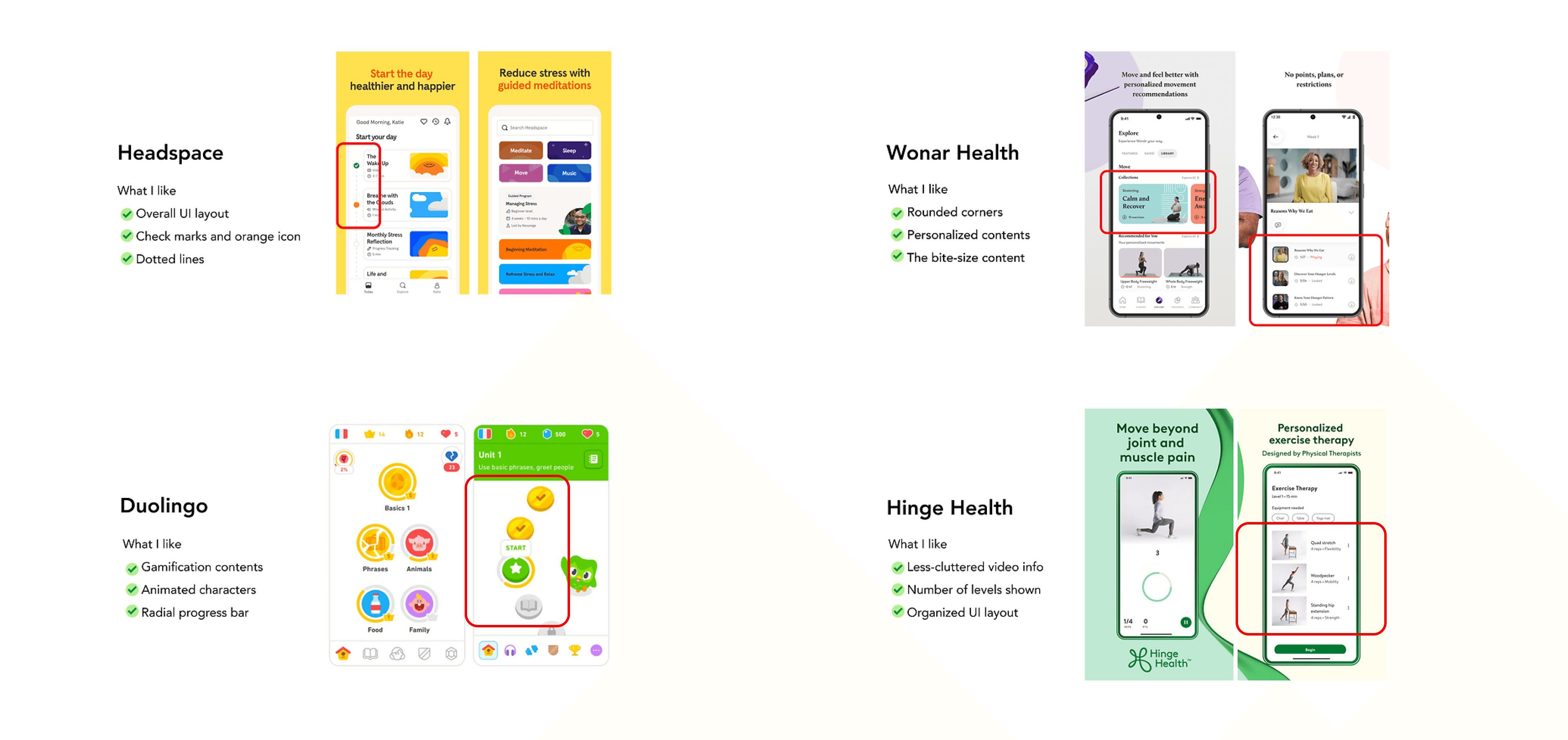
I looked into several apps, including Headspace, Wonar Health, Duolingo, Hinge Health, Coursera, and Khan Academy. This market research gave me valuable perspectives on user-friendly interfaces, engaging content from visually appealing UI designs, and the user experience of the overall navigation.
MARKET RESEARCH: Evaluating existing educational/healthcare mobile apps to gain inspiration
Since educational content was important for wound patients, I reorganized the home screen features by prioritizing educational content. The top section includes personalized education content based on their wound therapy status. The navigation to access videos has also been streamlined, reducing the number of clicks.
ANALYSIS: Applying UX analysis and market research into a bite-sized, personalized video content, with reduced number of clicks for users to access educational content intuitively.
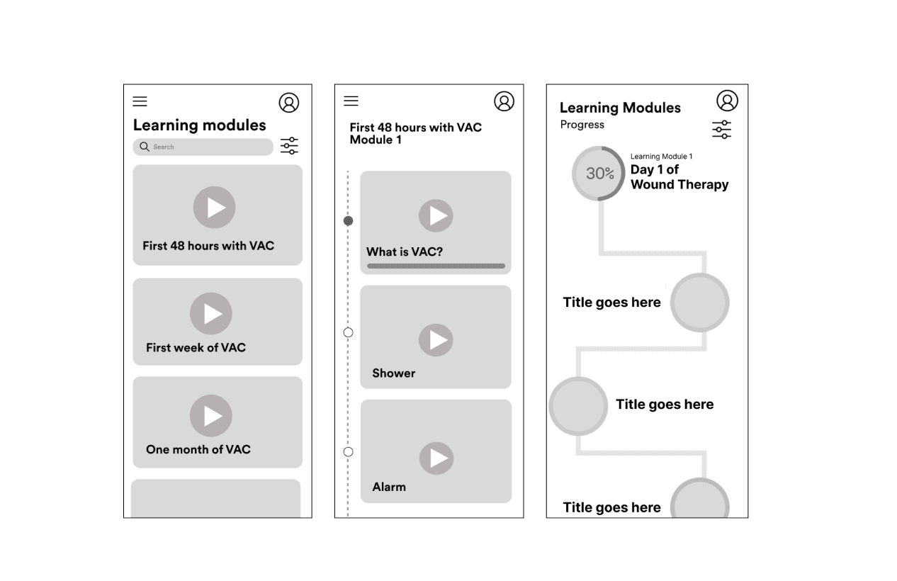
WIREFRAMES FOR THE EDUCATIONAL CONTENT
RESULT
Mid-fidelity wireframes and prototypes were created. Conceptual designs were presented to a team of internal and external stakeholders and the project proceeded to the MVP.
Due to the confidentiality of this project, I am unable to show the entire process. Reach out to me to access the full case study. :)
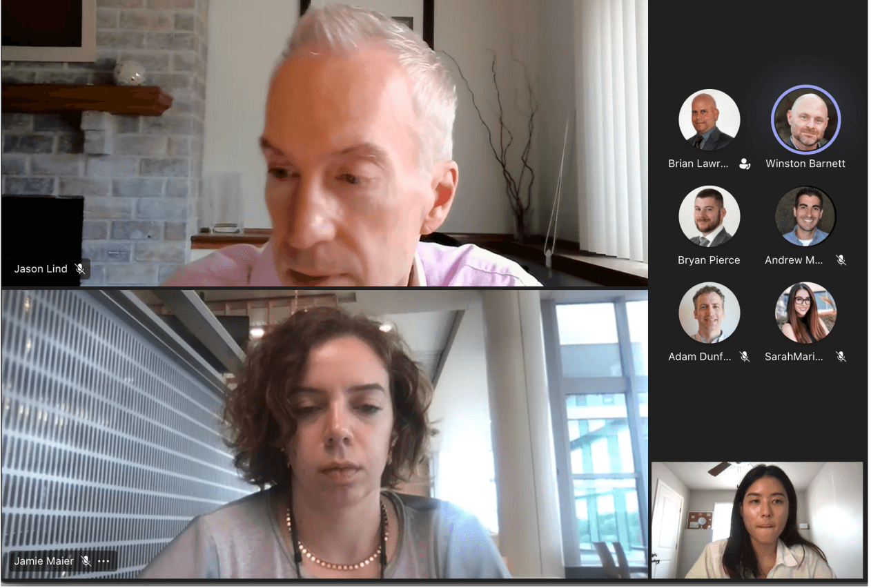
HIGHLIGHTS FROM MY 3M INTERNSHIP EXPERIENCE


A virtual webinar was held to further emphasize the action to drive a new agricultural revolution.
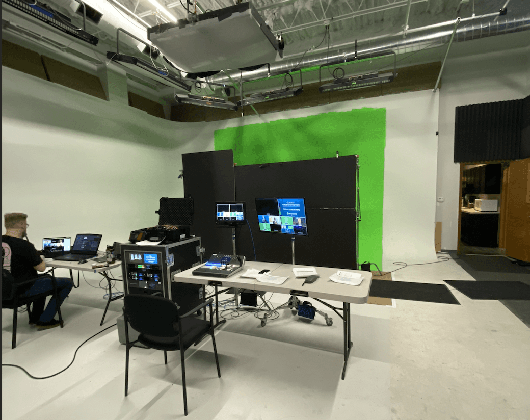
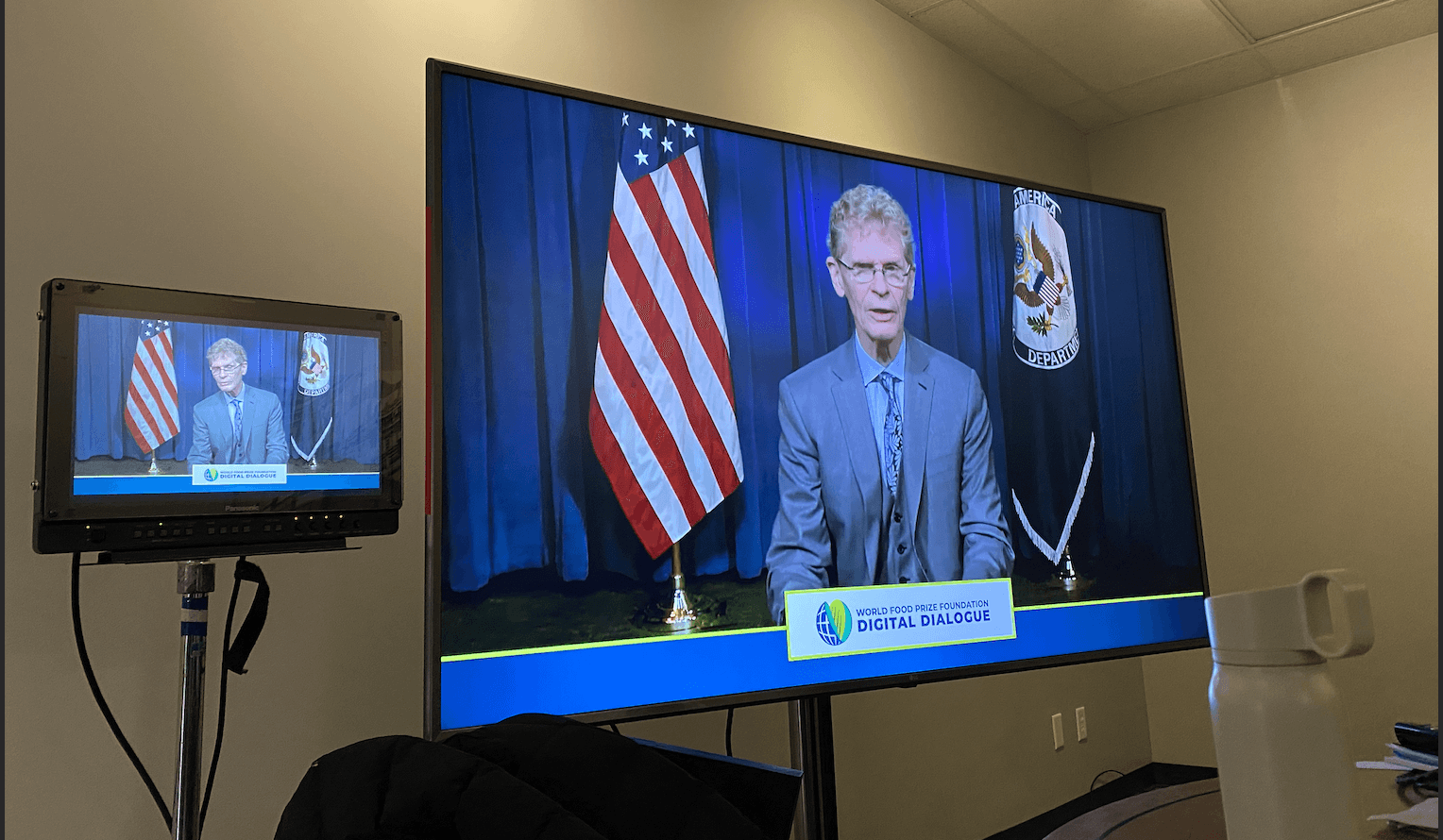
A behind the scene during the live webinar at Studio Iowa, a video production company
Speaker: Cary Fowler, Former Special Envoy for Global Food Security, U.S. Department of State
ethstehshst
OVERALL PROCESS
LEARNING ABOUT THE HEALTHCARE ECOSYSTEM
My 3M Healthcare Business Group Team
The first few weeks was a lot of learning about how healthcare system works and the ecosystem of it.
I am also grateful for the opportunity to work this a group of amazing, talented and smart people!
UX RESEARCH + PROBLEM STATEMENT
A team of UX researchers conducted user research (I was not involved in this research) to discover patients' needs and pain points of using the MyWoundHealing app while undergoing wound therapy. One of the findings was that patients do not feel engaged with the current app's educational content due to poor usability issues. This resulted in only 2% of patients downloading the app. Hence, the question statement is:
How might we engage patients with educational content to
feel confident with their wound care and achieve clinical outcomes?
UX METHODOLOGY 1A: User flows
To find out why the education content was not engaging, user flow and information architecture were created from the current MyWoundHealing mobile app.
UX METHODOLOGY 1B: Zooming into the user flow, focusing on educational content
To find out why the education content was not engaging, user flow and information architecture were created from the current MyWoundHealing mobile app.
UX METHODOLOGY 2: Heuristic analysis
To find out why the education content was not engaging, user flow and information architecture were created from the current MyWoundHealing mobile app.
UX METHODOLOGY 3: Information architecture
Based on the issues and user flows from the existing mobile app, an information architecture was created to reduce cognitive load, improve navigation, and ensure that users don’t feel lost or overwhelmed by the educational content.
MARKET RESEARCH
I looked into several apps, including Headspace, Wonar Health, Duolingo, Hinge Health, Coursera, and Khan Academy. This market research gave me valuable perspectives on user-friendly interfaces, engaging content from visually appealing UI designs, and the user experience of the overall navigation.
ANALYSIS
Since educational content was important for wound patients, I reorganized the home screen features by prioritizing educational content. The top section includes personalized education content based on their wound therapy status. The navigation to access videos has also been streamlined, reducing the number of clicks.
WIREFRAMES FOR THE EDUCATIONAL CONTENT
RESULT
Mid-fidelity wireframes and prototypes were created. Conceptual designs were presented to a team of internal and external stakeholders and the project proceeded to the MVP.
FINAL DESIGNS
Due to the confidentiality of this project, I am unable to show the entire process. Reach out to me to access the full case study. :)
HIGHLIGHTS FROM MY 3M INTERNSHIP EXPERIENCE